Friday, December 17, 2010

Final Project

Project Dimensions
Overall Dimensions
Invitation (cdecker_card): 15” x 7”
Pie labels (cdecker_pielabel, cdecker_pielid): 11” x 3.5”, 2.361”
Place card (cdecker_placecard): 4” x 3”
Save the Date (cdecker_savethedate): 5” x 7”
Thank you card (cdecker_thankyoucard): 5” x 7.75”
Bleeds
Invitation (cdecker_card):  .125 all four sides
Pie labels (cdecker_pielabel, cdecker_pielid): .123 all four sides, none
Place card (cdecker_placecard): .124 all four sides
Save the Date (cdecker_savethedate): .125 all four sides
Thank you card (cdecker_thankyoucard): .125 on bottom, right and left.
Flat or folded
Invitation (cdecker_card): Folded
Pie labels (cdecker_pielabel, cdecker_pielid): Flat for both.
Place card (cdecker_placecard): Folded
Save the Date (cdecker_savethedate): Flat
Thank you card (cdecker_thankyoucard): Folded
Purpose of the piece
Invitation (cdecker_card): To invite guests to Decker Event Designs’ annual open house.
Pie labels (cdecker_pielabel, cdecker_pielid): Thank guests for attending annual open house.
Place card (cdecker_placecard): To show guests where they will be sitting for the evening.
Save the Date (cdecker_savethedate): To let guests plan and know about the annual open house.
Thank you card (cdecker_thankyoucard): Thank guests for attending annual open house.
Target audience
Invitation (cdecker_card): Guests of Decker Event Designs’ annual open house, guests may include caterers, photographers, magazine writers and other important people in the event coordinating field.
Pie labels (cdecker_pielabel, cdecker_pielid): Guests of Decker Event Designs’ annual open house.
Place card (cdecker_placecard): Guests of Decker Event Designs’ annual open house.
Save the Date (cdecker_savethedate): Guests of Decker Event Designs’ annual open house, guests may include caterers, photographers, magazine writers and other important people in the event coordinating field.
Thank you card (cdecker_thankyoucard): Guests of Decker Event Designs’ annual open house.
Call to Action
Invitation (cdecker_card): To regret or plan on attending the event.
Pie labels (cdecker_pielabel, cdecker_pielid): Remember the event and use Decker Event Designs for future events.
Place card (cdecker_placecard): To have guests sit in their assigned seats.
Save the Date (cdecker_savethedate): To plan on attending the event.
Thank you card (cdecker_thankyoucard): To thank guests for attending the event.
Image list
Invitation (cdecker_card): Screen tint 1, screen tint 2 and reverse 2.
Pie labels (cdecker_pielabel, cdecker_pielid): Duotone raster and raster silhouette.


Copyright Statement
All photographs were retrieved from www.creativecommons.com and are free stock images.
The pie used in the label was retrieved from a free clip art site, www.clker.com.
The flower used in all of the projects was created by me.

Wednesday, December 1, 2010

Publication Advertisement

Thumbs
Full page rough

1/2 Horizontal

Full page finished
Bleed 8 1/4 x 11 1/8
Trim 8 x 10 7/8
Live/Non-Bleed 7 1/2 x 10 3/8

1/2 Horizontal
Bleed 8 1/4 x 5 1/2
Trim 8 x 5 1/4
Live/Non-Bleed 7 1/2 x 4 3/4

The only requirement of Cosmopolitan magazine was to have the image sent in to Hearst Ad. Gateway in PDF format.

Project Specifications
For this assignment I decided to design a publication advertisement for Cosmopolitan magazine. After deciding my audience and seeing that it matched Cosmpolitan's audience I looked up their magazine specifications and found this.

The audience of Cosmopolitan are interested in fashion, beauty and trends. Upon coming to this conclusion I decided to design an ad for a shoe company, ShoeDazzle. I found all of my images on Flickr's section of photos, Creative Commons.

The call to action for these advertisements will be to purchase ShoeDazzle's shoes.

Monday, November 29, 2010

Variable Data

Project specifications:
For my variable data direct mail piece, I have decided to design a postcard to be sent to customers of a fictional pet hospital. I had originally thought of doing a direct mail piece on a photography business, but due to lack of high quality pictures I was unable to do that. Leading me to realize it's time to take a photography class! I did find a ton of great images on http://www.dreamstime.com/ and they inspired me to do this project for a pet hospital

Part of this assignment is to include two data changes; for my two changes I decided to change the images that would show up on the post card depending on what kind of animal lived in the home and also the pet's name.
My target audience for this piece will be people who need to bring in their pet's for annual check ups.

The call to action for this piece will be to have the pet owner call Healthy Paw's to book their annual check up appointment.

Roughs:


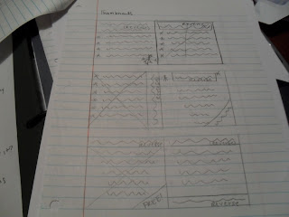
Thumbnails:


Finished product:


Sunday, November 14, 2010

Four States Regional Technology Conference

After reviewing the schedule for the Four State Regional Technology Conference I was a little worried about finding a session that I would be interested in. I have to admit I was a little disappointed in the lack of graphic design sessions during the conference. After narrowing down all of my options I found a session that I was slightly interested in, "Photography- A Review Going Wild." I am very glad that I attended this session; Dr. Robert C. Wiseman taught me more in that hour long session than my photography teacher did this past semester. Dr. Wiseman is a professor at Eastern Illinois University. He went into great detail about what exactly a F/Stop is, which can be figured by (Focal Length/Diameter) and different information about shutter speeds. I really enjoyed his photographs that he brought in; he had a variety of photographs that he had developed. Many of the photographs were shot with lens he had developed. I also liked how he demonstrated a pin-hole camera and showed us the pictures that a pin-hole camera can produce. The way he presented information to the class was also refreshing. He didn't just talk to us, but allowed us to think creatively.

After seeing his session I definitely have a better appreciation of all the resources we have today. Things that took him days to produce in a black room now take one click of a mouse in PhotoShop.

Image provided by Malcolm Turner, Pittsburg State University photographer

Thursday, November 11, 2010

Newspaper Ad

Newspaper Ad Proposal

Event:
Santa’s Little Helper Babysitting Day
Greek community service babysitting day
Free event
December 4, 2010 from 10-2
Lunch will be provided
Children must be potty trained and please give all allergies

Target Audience:
Pittsburg State University staff and non-traditional students who have children that are potty trained.

Call to Action:
E-mail to reserve a spot

Budget: $100.00
Week 1 & 2: 1 x 6 = 6 x 4 = 24 Week 1 & 2: 1.83 x 6 Week 3: 2 x 6 = 12 x 4 = 24 Week 3: 3.79 x 6
Production Schedule:
1. Produce Ad: October 19
2. Approval: October 21
3. Edits and Revision: October 24
4. Deadline: October 26


Monday, October 18, 2010

Brendan Murphy

Brendan Murphy Symposium

"When you’re trying to get established in your career, the craft that you learn is essential," said Brendan Murphy, Pittsburg State University alumni. Every day students at Pittsburg State University are given challenges to develop skills that are essential to learning the craft of their professions. While in Pittsburg receiving the Outstanding Alumni for all of his accomplishments Brendan took time to speak to students, his words were inspiring to all that attended.

Like Brendan I am using the skills I am learning from my graphics minor as a safety net for a future career. I think it’s great that he went to school on a track scholarship and ended up in the graphic communications field and that someone going to school in a small town in Kansas ended up in New York. I also never realized how much writing really went into graphic communication jobs; Brendan said he spends seventy-five percent of his time writing and only five to ten percent of his time drawing. After learning this I will definitely have a better appreciation for writing to learn courses in this field. Another good point that he brought up is to, ""Never fall in love with technology, because technology will change."—Work on your design skills and ideas, not just technological skills, because the technology will change. Hearing from a professional in this industry and learning from their mistakes and experiences was very awarding.

After learning what Brendan has accomplished it really inspired me to push myself farther and not to settle for ordinary. To often I find myself thinking that moving to New York and being successful is not in my reach, but seeing someone who was once in my shoes being that successful makes me hopeful. I learned that I need to take my writing skills more seriously and focus more on my design skills, since technology is constantly changing. 


Image cited: http://www.pittstate.edu/press-media/detail.dot?id=248849

Gap Logo Fiasco


Gap Logo Fiasco
 
The Gap logo fiasco started when sales in Gap when down by 4%. In order to raise sales the advertisement teams proposed a change in logos. The new logo first appeared on their website, and received a lot of criticism. The logo was typed in what looks like Helvetica type and had a dark blue square above the ‘e.’ Change in logo made the company look cheap, the exact opposite of the former logo, which presented the company as being regal and rich. The change in logos angered loyal customers and did not help with sales. The change in logos did not go over well because they had to re-establish the company. In the long run the change of logo ended up hurting Gap because they had to change all signage and promotional materials used to promote Gap. The cost of the change in logo ended up costing the company far more than investing additional money in advertising. Personally I think Gap should have taken a better look at the economy and other factors that could have been affecting the decrease in sales. I think the problem with decreasing sales was more to do with the economy than their logo. Also I feel that the new logo is very cheap looking and not what Gap clothing is all about, while their old logo presents their company as being exclusive and rich. I don’t think that the change in logos would have brought in more customers; I think that has more to do with the cost and value of the clothing. They learned that you have to take in to consideration what loyal customers like and also that there is a lot more work that goes in to a logo change than just making some adjustments. In order to have a successful logo change there needs to be support of the company
because you have to make sure that customers still feel a connection with the company. Ultimately changing the brand of your company cost more than losing 4% in sales.

GIT Recruitment Note Pad